Website: Plan and Design
- Nov 8, 2017
- 1 min read
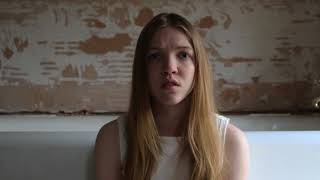
Since we have began to plan our website, we outlined a particular design and colour scheme that we felt matched our artist and what we wanted our website to look like. Since we wanted to express the deep red of the character's dress in the music video for "Control", and the innocence and purity expressed through our white plain dress,
We decided to work alongside our artist as much as possible, as well as express the messages and themes displayed in our digipak also. We felt it was important to keep to the same theme and make is memorable and distinctive for the audience.
We created a logo and matched our website around this. We wanted the logo to be the main focus and the most outstanding aspect of the website, in order for the name to be memorable for the audience. Therefore, we decided to display the name in a deep red, and have the font bold and thick.
We will plan a photoshoot to involve both the Digipak and the website, and will use these in our gallery, as well as on our pages. as a background.
We will include the pages:
- Home
- About
- Gallery
- Tour
- Videos


Comments